Mobile Legends: Bang Bang Improve These 3 Things In User Interface 2.0
GridGames.ID – Mobile Legends Bang Bang (MLBB) revealed the User Interface or commonly abbreviated as the latest UI in a note announced on its official Facebook on September 9 yesterday.
In the note, MLBB revealed that they had started a secret project codenamed Evolution, to provide the latest UI.
This UI upgrade will bring the Interface to the 2.0 era which can provide eye comfort when playing MLBB.
Also Read: This is the Visual Effects of Kadita’s New Skin in Mobile Legends ‘White Robin’
For this reason, MLBB improves these three things in UI 2.0 to increase user comfort when playing games.
Here’s the full explanation.
1. Improved Display Quality
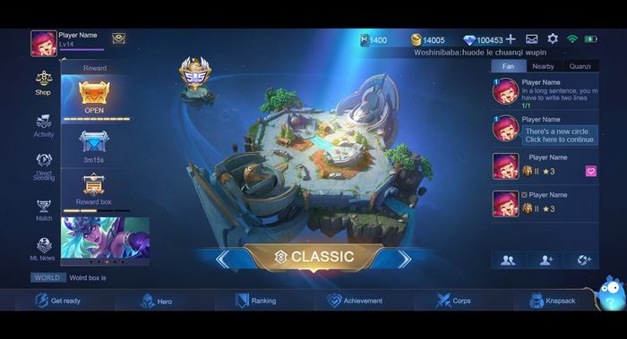
MLBB Facebook
UI 2.0
Unlike the previous one, the latest UI 2.0 leaves more space to display the Battlefield and the most striking point is the Layout of the Lobby.
As soon as you enter the game, Battlefield will immediately catch your attention where the Battlefield is seen more clearly, such as the entire river path, Jungle, and Creep location.
The old Battlefield featured a 2D format due to layout restrictions, and the current one will be presented in CG format with an amazing and more realistic design.
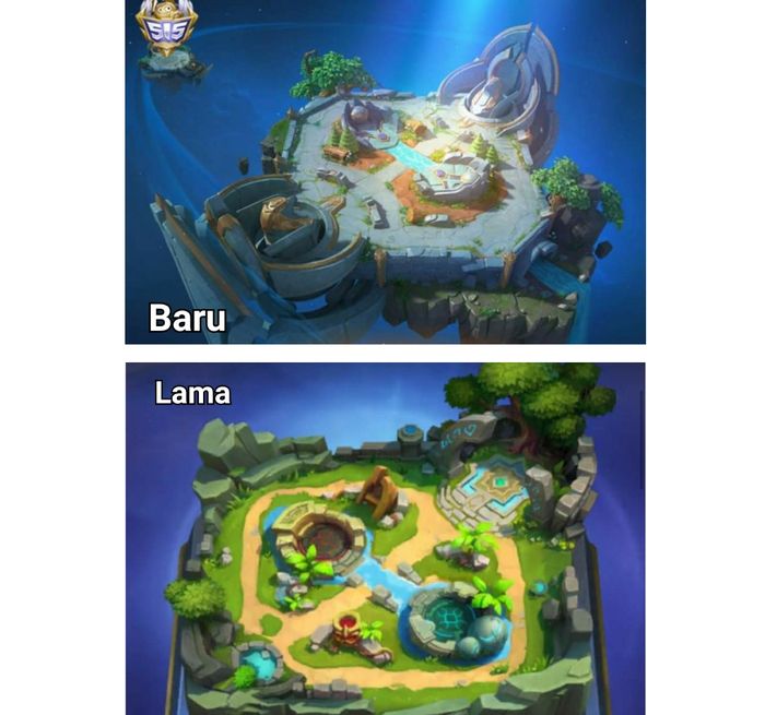
GridGames
Comparison of new and old battlefields in MLBB
This UI upgrade does prioritize the Battlefield which is an important element in the MOBA game.
The color scheme is also better, where blue is the main color which looks cleaner and softer, also creating a harmonious and comfortable atmosphere.
Even the display in light blue creates an eSports atmosphere which is unique in MOBA games, you know!
In addition to blue, there is a gold color that is presented in a realistic style that shows a sense of majesty and further enhances the quality of the game.

MLBB Facebook
Gold color in UI 2.0 MLBB
In the latest UI 2.0, the dynamic mist particle effect will be used uniformly, replacing the existing Flicker effect which is presented in a variety of ways with soft shading, making the whole Interface feel more real.
The UI 2.0 design is cleaner, with more artistic lines and improvements to the design with more sense and modernity.
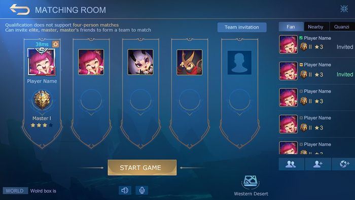
MLBB Facebook
Lobby MLBB UI 2.0
2. Optimizing Interaction
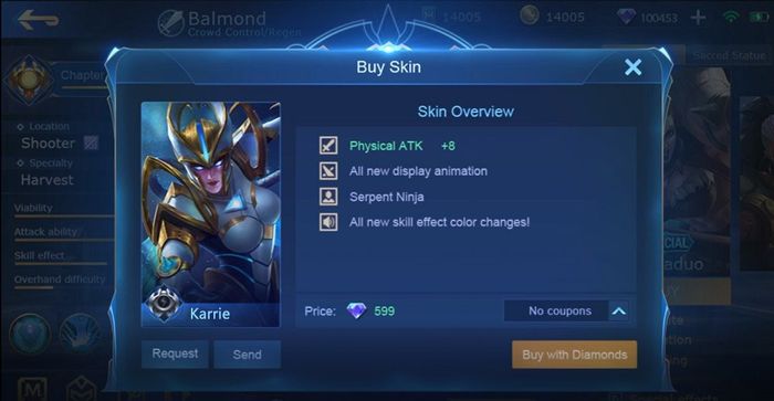
MLBB Facebook
MLBB UI 2.0 shop display
Apart from improving the overall appearance, UI 2.0 has also optimized its interactions, the most obvious being the sense of touch.
You will get a better interactive experience just by tapping on the screen.
Read also: Mobile Legends is the most popular game in Indonesia
The unique dynamic Ripple effect and Tap sound in UI 2.0 will bring you a brand new audio and visual experience.
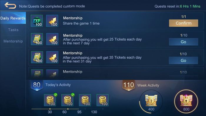
For example the Daily Rewards page, in UI 2.0, Quests are displayed vertically, allowing you to scroll down the page when you check Quests.
MLBB Facebook
Daily rewards at MLBB UI 2.0
Therefore, it is easier to read the content of each Quest and it is easier to check more Quests.
MLBB Facebook
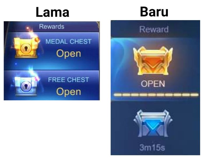
MLBB UI 2.0 reward display
3. Memory Reduction and Enabling Smoother gaming experience
Although UI 2.0 has greatly improved its appearance and interaction, the performance requirements for your phone will not increase at all.
What’s more, as interactive logic has been improved, the actual performance requirements are reduced.
Also Read: Inferno Soul, Leomord’s Latest Epic Skin in Mobile Legends Released Today
Because of this, the updated UI will hardly cause any lag or crashes and won’t use up more storage.
Additionally, improvements in UI 2.0 also include Background Music and interactive sound to provide an even better audio and visual experience.
PROMOTED CONTENT
Featured Videos
Komentar
Posting Komentar